Analyzing Image Collections Using Python
Quantitative and Qualitative Explorations
Visualizing data for visual assets, like photographs, introduces interesting challenges. Many visual properties of photography cannot necessarily be mapped to standard visualization methods, particularly when working with large image libraries.
Digital photographic images are embedded with technical data that can be sorted, grouped and analyzed for patterns. Photographs also cover subject matter and have external success measures, like sale prices, that can be sorted and plotted in more traditional tables and graphs. Finding ways to “see” photographs through data and in the data provides a frontier for photographic study. This combination of quantitative and qualitative variables offers interesting options for visualizing creative content collections. Creative content professionals can use the below tools to identify trends among assets, collections, and subject-matter, based on different qualities. Grouping image assets by their physical properties, such as hue and saturation, may also provide innovative ways to present assets to viewers.
This project explores some of the ways to analyze a collection of images using Python, Imageplot, Excel, and Tableau. Filtering a commercial stock library by photographer, six collections are analyzed and compared using different metrics.
Selecting a Subset of Image Collections
Tetra Images is a commercial stock photography and videography collection. Images and videos are licensed across the globe for different projects at different price points. There is broad dispersion in number of transactions and earnings among all of the assets.

Step one was to identify six collections within Tetra that met certain criteria for the project. The collections needed to have between 500 and 1,000 recorded sales transactions, and they should meet an earnings threshold in the top 20% of all collections on the basis of earnings-per-image.

An initial exploration in Excel to identify higher and lower earnings over 2019. Red dots show lower earnings totals.
Excel for Initial Analysis
Excel is the tool used for the initial selection process. The icon sets feature identifies earning trends with red dots and spark lines. Excel was then used to add and count all sales transactions and average all totals, by photographer. In this case, the threshold is $70 per sale during the time frame of 2019 to be in the top 20% of earners. Green flags show highest return per sale (top 20%) and green rows highlight the photographers who meet the pre-determined criteria.

Green highlighted rows represent the sub-collections that meet the selected criteria.
Tracking 6 High Earners
Average prices over time for the 6 collections is more volatile and higher than the average prices for the whole Tetra collection.

Tableau charts compare the avg sale price per transaction for all Tetra assets vs. six selected collections.
Plotting Jpeg Images
Brightness and Saturation Scatter Plot
Using ImageJ and ImagePlot from Software Studies Initiative, attributes of brightness, saturation, and hue for the six collections were measured and recorded in CSV files. Then Python is used to plot the jpegs according to any measures chosen.
def absoluteFilePaths(directory):
   for dirpath,_,filenames in os.walk(directory):
       for f in filenames:
           yield os.path.abspath(os.path.join(dirpath, f))
images = []
for p in paths:
    foo = Image.open( p )
    foo = foo.resize((int(foo.size[0]/20) , int(foo.size[1]/20)),Image.ANTIALIAS)
    images.append( foo )

fig, ax = plt.subplots()
ax.scatter(x, y)

for x0, y0, image in zip(x, y,images):
    ab = AnnotationBbox( OffsetImage(image)  , (x0, y0), frameon=False)
    ax.add_artist(ab)
Jpegs for Points
This Python script substitutes jpegs for points in a scatter graph. The images must be resized to plot properly. This method was used to plot the images based on sales revenue and number of transactions, as well. This method gives a direct visual reference of the photos which can be invaluable when looking for patterns. Spreadsheet data and database data without thumbnail reference, can be limiting for creative directors who wish to understand their collections visually by directly seeing the image mapped to its numeric value sets.
Below are plots for brightness (x-axis) and saturation (y-axis) for each of the six collections. Sizing and plotting jpegs right onto the graph is an efficient way to find patterns while seeing the specific asset.

AU collection

CT collection

DC collection

NC collection

PX collection

SA collection
Collection Subject Analysis
Sankey Diagram to Visualize Collection Subject Categories
The image collections have spreadsheet metadata that include captions, keywords, and model release columns. Based on the words in the captions and keywords, images were assigned to subject categories using conditional highlighting in Excel and then grouped by whether there was a release listed or not. Those without releases are “no people.”
import plotly.graph_objects as go
fig = go.Figure(data=[go.Sankey(
    node = dict(
      pad = 15,
      thickness = 20,
      line = dict(color = "black", width = 0.5),
      label = ["AU", "CT", "PX", "Business", "Families","Sports", "Animals", "Scenics","Other"],
      color = "#206fb2"),
    link = dict(
      source = [0,1,11,12,2,13,0,1,11,12,2,13,9,9,9,9,9,9,10,10,10], # indices correspond to labels, eg A1, A2, A2, B1, ...
      target = [9,9,9,9,9,9,10,10,10,10,10,10,6,7,5,3,4,8,6,7,5],
      value = [165,291,32,171,340,76,32,0,302,56,34,72,3,11,9,36,29,77,2,5,1,1,1,22]
  ))])
fig.update_layout(title_text="Content by Collection", font_size=10)

Collections hold “people” and “no people” in images. Images belong to subject categories.
scales = alt.selection_interval(empty='all' ,bind='scales',)
selection = alt.selection_multi(fields=['subject', 'collection'])
color = alt.condition(selection,
                      alt.Color('subject:N', legend=None,
                                    scale=alt.Scale(scheme='dark2')),
                      alt.value('transparent'))

scatter = alt.Chart(source).mark_point().encode(
    x = alt.X('transactions:Q', scale=alt.Scale(zero=False,type='log')),
    y= alt.Y('revenue:Q', scale=alt.Scale(zero=False,type='sqrt')) ,
    color= color,
    tooltip=[alt.Tooltip('filename:N'),
             alt.Tooltip('revenue', format="$"+'.2f')]
).add_selection(scales).interactive()

legend = alt.Chart(source).mark_rect().encode(
    y=alt.Y('subject:N', axis=alt.Axis(orient='right')),
    x='collection:N',
    color=color
).transform_filter( scales ).add_selection(
    selection
).properties(title="select dimension")
Sales Data by Subject and Collection with Interactive Legend
Interactive legend and scroll zooming allow the user to identify specific high-performing assets within subject categories.

Clicking on the legend allows for selection of one or multiple subjects and collections to see earnings
Dominant Color Analysis
Using Python with the following packages: numpy, pandas, matplotlib, and KMeans allows finding the dominant color represented in each image in the collections and writing them to CSV.
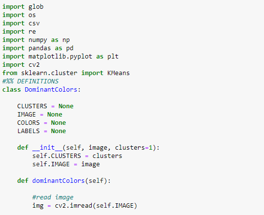
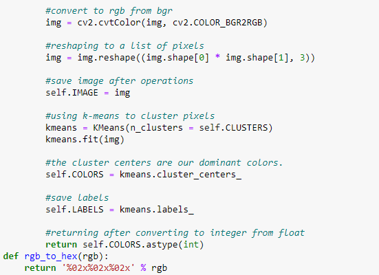
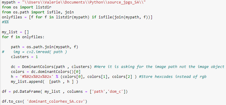

Kmeans to cluster pixels of the jpeg images and identify dominant colors with Python. Only one cluster was used for the images in this example. However, the number of clusters can be increased, if desired. This script outputs a CSV file of the dominant hex value for each image along with a path to the photo (right).
Using Python to return Color Grids of Dominant Colors
Python with seaborn package creates a color grid of the dominant colors for each of the selected collections. Opening the color squares requires high random access memory (RAM) usage, which is why working with smaller sub-collections was more practical for this project.

Seaborn package to return hex colors in a grid.

Python with seaborn package is an easy way to return grids of the dominant color values that were gathered through kmeans clustering script.
Hex Values as Graph Points


A dropdown filter for selecting collection (left) and an interactive legend for selecting by subject (right) provide ways to analyze dominant color values of the assets. This allows for identifying a specific palette for a photographer or topic.
Interactive Visualizations to Measure Licensing Success
(These are screenshots that still need to be embedded)
Radio Button Highlighting by Collection and Subject Based on Revenue

A radio button highlighting filter allows for selection of one collection to evaluate the success measures of individual images represented by each point by one photographer, based on sales transactions and total revenue. The tooltip reveals the image filename. Inside the graph, scrolling allows the viewer to zoom into specific points of data.


